In a world that glows with screens, where attention flickers fast, the first thing someone sees isn’t what you say it’s how you look. For a solopreneur, visual branding isn’t “nice to have.” It’s the difference between a profile that disappears in the feed, and one that feels real enough to slide into the DMs.
But here’s the thing: you don’t need a fortune. You don’t need a design team. Not in 2026.
You only need smart tools, a little creativity and the heart to shape your identity with care.
If you’re building from scratch, bootstrapping hard, or just figuring out your brand vibe these visual branding tools, chosen for being wallet-friendly and high impact, can shift your business from “just another profile” to “memorable presence.”
Let’s walk through them. Slow. Real. Practical.

1. A Simple Logo That Doesn’t Scream “Cheap”
You don’t need a multi-thousand-rupee designer contract to have a decent logo. What you need is a mark that feels like you.
Use free/affordable logo-making tools
Platforms where you pick clean fonts and minimal shapes nothing flashy, just honest. Upload your own photos, tweak colors to match your brand vibe, download PNG/SVG and you’re done.
Your logo becomes less like a sticker, more like a signature: subtle, simple, and recognizable.
What matters is consistency, not complexity.
2. A Color Palette That Speaks Without Saying a Word
Colors carry emotions.
Green = calm, growth.
Orange = warmth, energy.
Dark-blue = trust, professionalism.
Soft-pink = nostalgia, softness.
Before you choose random “pretty” colors, pick a mood. A feeling.
Then build your palette around that mood:
- Primary color – base
- Secondary color – accents
- Neutral shades – backgrounds, text
- One highlight color – CTA buttons or visuals
Use free online palette-generators if you don’t know where to begin.
Once chosen stick to it everywhere.
Websites, social posts, reels, even WhatsApp make your brand color your invisible voice.

3. Typography That Feels Like Your Voice
Fonts matter.
A lot.
Serif, sans-serif, bold, light, handwriting every style carries a vibe.
Want elegance? Gentle.
Want modern minimalism? Clean.
Want personality? Slight variation, maybe a handwritten heading, but clean body text.
Free web-font providers in 2026 make this easy.
Pick 1 heading font + 1 body font, and treat them like constants.
Over time, people recognize the writing before even reading the words.
That’s branding whispering, not shouting.
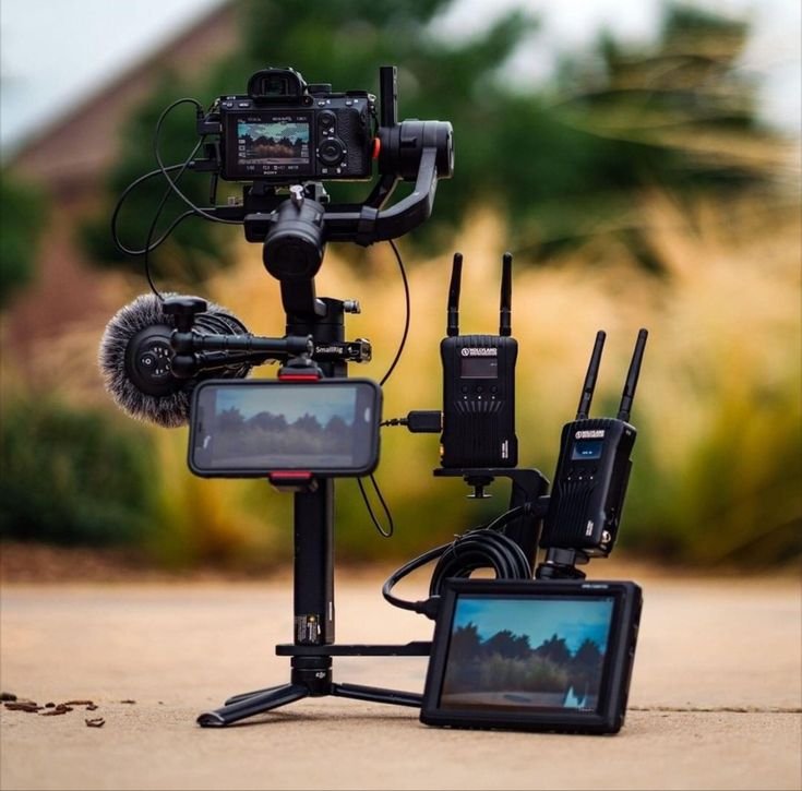
4. Authentic Photos Even If You’re Not a Pro Photographer
Not everyone has a studio. Not everyone has pro gear.

But you do have your phone. And you do have sincerity.
DIY photo tips:
- Soft, natural light (window, morning or late afternoon)
- Clean backgrounds (plain walls, textured fabric, wooden surfaces)
- Neutral clothes that don’t distract
- Simple props relevant to your business (not clutter)
Combine this with a basic color-palette overlay or subtle filter suddenly your feed doesn’t look like random stock photos. It looks like your world.
Consistency over perfection. That’s your mantra.
5. Minimal, Clean Layouts Not Overloaded with Noise
Social media feeds crave white space.
Visual breathing room.
Buyers aren’t impressed by information overload.
They’re drawn to clarity.
Design templates for:
- Quote posts
- Carousel posts
- Product/service promos
- Stories or reels covers
Keep margins, keep padding, keep readability.
Don’t jam your post with every tagline you ever wrote.
Let one message shine.
A clean layout with a consistent color-typography scheme becomes your silent visual identity.
6. Simple Video Tools for Reels, Shorts, and Light Editing
Short clips, quick captions, subtle editing the new norm.
But you don’t need heavy software or monthly subscriptions to make them.
Affordable or free tools exist to crop, add captions, sync music, overlay brand colors, export in correct vertical format.
You bring the content; the tool brings the polish.
Consistency in video visuals matters as much as in static posts but with motion, brand personality feels alive.
7. Digital Brand Guideline: Your Invisible Rulebook
You may be solo but you’re building a system.
Create a simple digital Visual Branding Tools guideline sheet (Word, Google Docs, or PDF) with:
- Logo versions (colored, black-white)
- Color-palette hex codes
- Font names and usage rules
- Layout rules (margins, image style)
- Caption style/tone rules (serious, friendly, warm, minimal)
- Hashtags & posting frequency suggestions
It’s your personal brand Bible.
It keeps you consistent even when you’re tired, rushed, or juggling a hundred things.
8. Feedback Loop Test Visuals, See What Sticks
Your brand, especially visuals, isn’t built in a vacuum.

It’s shaped by responses, by patterns.
Post slight variations.
Carry subtle shifts.
Observe what draws engagement, what gets saved, what gets no reaction.
Track:
- Color variants
- Photo styles (bright vs warm vs moody)
- Caption tone (fun vs serious)
- Layout types (single image vs carousel vs video)
Gradually, you’ll see your “look” emerging the one that feels right, that represents you, and that resonates with your audience.
9. Consistency The Biggest Secret Weapon
You might have a good logo.
A nice palette.
Clean fonts.
But if you use them only sometimes one month yes, next month no the brand’s memory becomes weak.
Regularity builds an imprint.
People begin to recognize.
They remember.
They feel a sense of comfort even in scroll chaos.
Think of your brand aesthetics as a rhythm.
Show up on time, with your style, habitually.
That familiarity builds trust.
10. Your Story Your True Branding Edge (Never Budgeted)
All the visuals in the world mean nothing without your story behind them.
What you stand for.
Why you do what you do.
Who you’re trying to help.
What values you carry.
Your story gives texture, soul, movement.
The rest colors, fonts, photos are only the frame.
So invest time in writing a simple but honest mission statement.
Know why you exist.
When clarity lives behind your visuals, everything looks intentional.
Conclusion
If you thought Visual Branding Tools was luxurious, think again.
In 2026, for a solopreneur who is willing to pay attention, the resources are limitless and the cost? Minimal.
Your best tools aren’t always the expensive ones.
They are the honest ones.
The tools that help your essence whisper, not shout.
That reflect who you are, not who you think you should be.
When something costs little but conveys truth, it becomes high-impact.
When your visuals reflect your values, your voice, your vision you don’t just build a brand.
You build trust.
You build memory.
You build identity.
Use these Visual Branding Tools with patience, authenticity, rhythm and watch your small presence grow into a presence that matters.
FAQs
1. Do I need professional photos for a strong brand look?
Not always. Natural light + honest content + consistent editing often does the trick better than over-edited stock photos.
2. Can I use free online tools for all this?
Yes there are many reliable free or low-cost tools that handle logos, font pairing, color palettes, social templates, and video editing.
3. What if I’m not creative?
That’s okay. Start simple. Stick to minimal design. Let your authenticity carry the weight. Consistency builds recognition more than flash.
4. How often should I post to build visual brand identity?
Consistency over frequency. Even 2-3 quality posts per week, following your brand style, beats random heavy posting.
5. Is a brand guideline necessary for one-person business?
Yes. It keeps you aligned, helps you stay consistent even when tired or busy and ensures your brand voice stays recognizable.